


Our logo
Our logo is our flag. It represents us as an organization, the amazing people who work here, the open source communities we collaborate with, and the members who support us. It is also a reflection of our purpose and professionalism. It is important that it is always used the right way, so that people are able to identify us at a glance. The logo has two variations: the primary “stacked” version and a secondary “horizontal” version.

Primary logo
This is our primary logo and should always be used where possible.
Secondary logo
This is our secondary logo, and should only be used in instances where the primary logo will not be able to display correctly.
Monochrome variations
When the full-color logo can not be used, there are two variations available.
Use the white version on dark backgrounds when the full-color logo is unsuitable or color reproduction is limited.
Use the dark version on light backgrounds to ensure clear contrast and consistent legibility.
Use the white horizontal version on dark backgrounds when a compact, wider layout is required.
Use the dark horizontal version on light backgrounds where the primary stacked layout is not practical.
Spacing
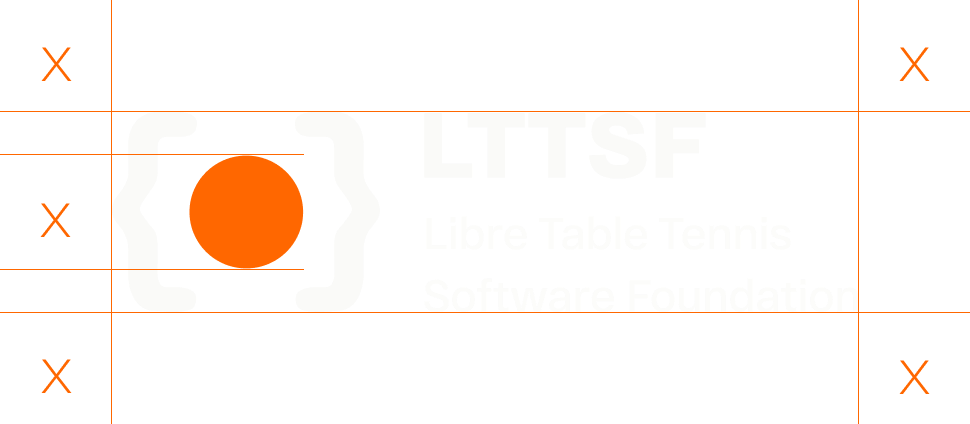
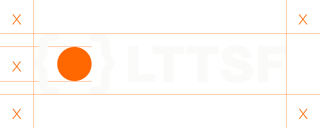
Logo clear space
To ensure the logo remains clear and recognizable, a minimum amount of space must always be maintained around it.
The minimum clear space, represented by X, is equal to the diameter of the table tennis ball within the logo symbol. This distance must be preserved on all four sides of both the primary and horizontal logo variations.
No text, graphics, or other visual elements should enter this area.
Colors
LTTSF Orange
#FF6700
Our signature color, representing the energy of table tennis, innovation, and creativity.
Graphite
#1E2023
A deep, modern tone that provides contrast, stability, and a strong visual foundation.
Soft Ivory
#FAFAF8
A warm, neutral shade that brings clarity, simplicity, and balance to our identity.